Dashboard page
The Dashboard page displays the overall statistical data from the server in a visual format, by means of the following charts:
- EVENTS RATE
- ALARMED / FAULTY / TOTAL PANELS
- ALL PROCESSES
- ONLINE (SUPERVISION) / CONNECTED PANELS
- CONNECTED CUSTOMERS
- BILLING STATISTICS
Figure. Navigating the Dashboard page
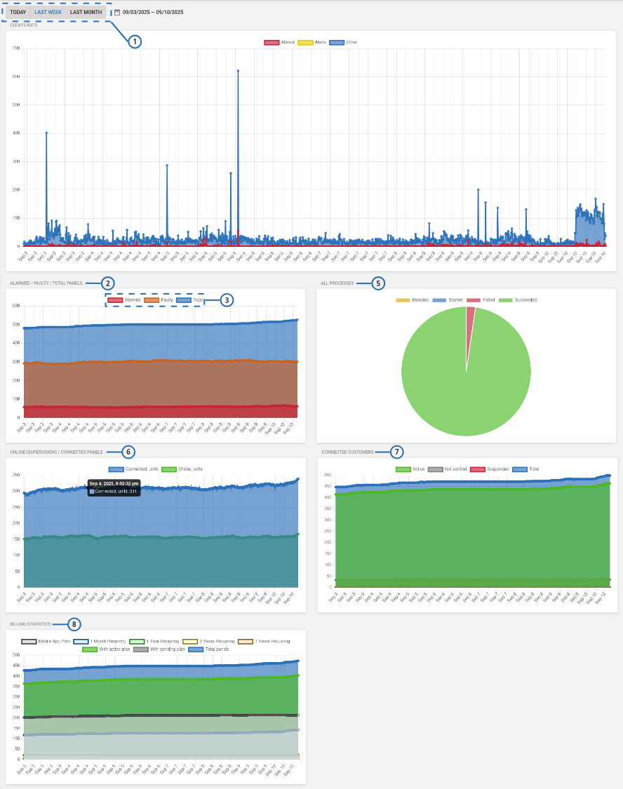
| Callout | Name | Description |
|---|---|---|
| 1 | Time range | To select the interval displayed by the charts, click TODAY, LAST WEEK, LAST MONTH, or click on the calendar icon to set a custom interval note The interval that you set applies to all dashboard charts. |
| 2 | ALARMED / FAULTY / TOTAL PANELS | Added Alarmed panels to the existing FAULTY / TOTAL PANELS chart. |
| 3 | Data filters | Click on the data filter to exclude or include the related data from the graph. |
| 4 | Data details | Hover over a chart point to display data details |
| 5 | ALL PROCESSES | The ALL PROCESSES pie chart displays number of Failed and Succeeded processes. |
| 6 | ONLINE (SUPERVISION) / CONNECTED PANELS | The ONLINE (SUPERVISION) / CONNECTED PANELS chart displays number of panels that are connected to the server over time. |
| 7 | CONNECTED CUSTOMERS | Displays number of Active, Not verified, Suspended, and Total customers. |
| 8 | BILLING STATISTICS | Displays the number of panels for each billing plan type. |
EVENTS RATE
The EVENTS RATE chart displays number of Alarms, Alerts, and Other events:
- The X-axis measures time and date, according with the interval set at the page top
- The Y-axis measures the number of events
- Each point on the chart represents a 10-minute interval
Hover over a chart point displays data details.
Clicking over a chart point displays the Events page.
To exclude or include data from the chart, click on the data filters at the top of the graph.
ALARMED / FAULTY / TOTAL PANELS
The ALARMED / FAULTY / TOTAL PANELS chart displays number of Alarmed, Faulty, and Total panels.
- The X-axis measures the date, according with the interval set at the page top.
- The Y-axis measures the number of panels
- Each point on the chart represents a 30-minute interval
A faulty panel is a panel with at least one fault. For more information, see FAULTS column in Navigating the Equipment page.
Hover over a chart point displays data details.
Clicking over a chart point displays the Equipment page.
To exclude or include data from the chart, click on the data filters at the top of the graph.
ALL PROCESSES
The ALL PROCESSES pie chart displays number of Failed and Succeeded processes.
Hover over a chart slice displays data details.
ONLINE (SUPERVISION) / CONNECTED PANELS
The ONLINE (SUPERVISION) / CONNECTED PANELS chart displays number of panels that are connected to the server over time:
- The X-axis measures the date, according with the interval set at the page top
- The Y-axis measures the number of panels
- Each point on the chart represents a 10-minute interval
Hover over a chart point displays data details.
Clicking over a chart point displays the Equipment page.
To exclude or include data from the chart, click on the data filters at the top of the graph.
If a panel is connected, there is a live connection between the panel and the server. The term Connected does not mean Online.
For more information about the connection status, see connection status in Navigating the Equipment page.
CONNECTED CUSTOMERS
The CONNECTED CUSTOMERS chart displays number of Active, Not verified, Suspended, and Total customers:
- The X-axis measures the date, according with the interval set at the page top
- The Y-axis measures the number of customers
- Each point on the chart represents a 10-minute interval
Hover over a chart point displays data details.
To exclude or include data from the chart, click on the data filters at the top of the graph.
BILLING STATISTICS
The BILLING STATISTICS chart displays number of panels for each billing plan type:
- The X-axis measures the date, according with the interval set at the page top
- The Y-axis measures the number of panels
- Each point on the chart represents a 10-minute interval
Hover over a chart point displays data details.
Clicking over a chart point displays the Equipment page.
To exclude or include data from the chart, click on the data filters at the top of the graph.