< Previous | Contents | Next >
The Dashboard page displays the overall statistical data from the server in a visual format.
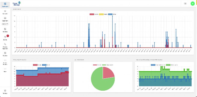
Figure 8. Navigating the Dashboard page
To see a description of the four types of graph on the Dashboard page, see the following definition list:
The EVENTS RATE graph displays visual data of events in three categories: Alarms, Alerts, and Other.
• The Y-axis measures the number of events.
• The X-axis measures time by calendar date.
• Each point on the graph represents 10 minutes.
The FAULTY PANELS graph displays visual data of the percentage of the total panels that are Faulty.
• The Y-axis measures from 0% to 100%. All of the panels comprise 100% and the position of the blue and red lines rep- resents a percentage of the total number of panels.
• The blue line represents faulty panels. A faulty panel is a panel with at least one fault. For more information about the faults column, see FAULTS column in Navigating the Equipment page.
• The X-axis measures time by calendar date.
• Hover over a line to view the percentage value. This percentage is a decimal of 1. For example, 0.7 represents 70%.
The All processes pie chart displays visual data of the percentage of processes that fail and succeed.
The CONNECTED PANELS graph displays visual data of the number of panels that are connected to the server over time.
Online. For more information about the connection status, see Connection status in Navigating the Equipment page.
Related topics Panels page Processes page Events page